Apron/shirt - well when it comes to making a mess and wanting to ruin your clothes, you will definitely need one of these or shirt so you don't get a lot of stains/marks on your clothes that you like to wear on a daily basis.

Acrylic paint - This is where the printing begins because above all else, you need make to make your posters and t-shirt happen!
For you T-shirts especially you need to mix 1 part Acrylicint, 2 parts medium into a plastic container with emulsion to make Acrylic mix paint. As I said this is for when you make T-shirt, otherwise they were get ruined every time you wash it and leaves a huge stain.

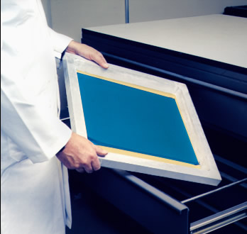
Screen - The screen is also a printing medium to make you prints happen. There are different kinds of screen each with a different mesh that you can use. Most screens can be either wood or metal,
By learning the basics of screen mesh and fabric preparation, you can quickly improve the quality of your prints and prevent common screen problems such as pinholes, poor detail, and poor ink coverage. We will begin by explaining mesh counts, weaves, and thread diameter. Once we have a basic understanding of the mesh itself, we can look at stretching and preparing the screen mesh for emulsion.
Stainless steel, nylon, and silk are also available but the polyester is the most common for garment printing. Two different types of mesh weaves are available. Plain weave is a simple one-over/one-under pattern similar to a basket. This allows for a very sharp print when you are screen printing detailed designs and the weave is a two-over/two-under pattern. This does not provide the sharp detail like the plain weave but it does allow for more ink to pass through the mesh at higher mesh counts. Most applications are best when printed with plain weave mesh.
Thread thickness is also very important. You may not realize it but many mesh counts that you order are available in different thread sizes. For example, 305 mesh count is available in a thread thickness of 31, 34, and 40 microns. The 305 mesh count screen with 31 micron thread diameter is able to tension 21 to 24 N/cm. This is much less tension than the 40 micron thread (27 to 32 N/cm). You may want the tighter screens for high-end printing but you also must consider the change of ink deposit between the different screens. Even though they are all 305 count screens, they all have different theoretical ink deposits and different fabric thickness.
Mesh color is also something to consider. Some people often ask what the difference is between white and dyed mesh. White mesh for counts ranging from 17 meshes/inch to 158 meshes/inch. Anything above 158 meshes/inch it is important to use dyed mesh. White mesh has a tendency to refract light. This causes undercutting of your stencil and you can lose important detail. Yellow mesh reduces refraction because it reduces the travel of ultraviolet light. Dyed mesh will take a longer exposure time but it is a small price to pay when you could be losing fine lines and half-tones.
Using proper mesh tensioning procedures will allow for optimum print control and performance. It is important to understand that one definitive mesh tensioning level does not exist. Every mesh count, every thread diameter, and every thread material may tension at different levels.
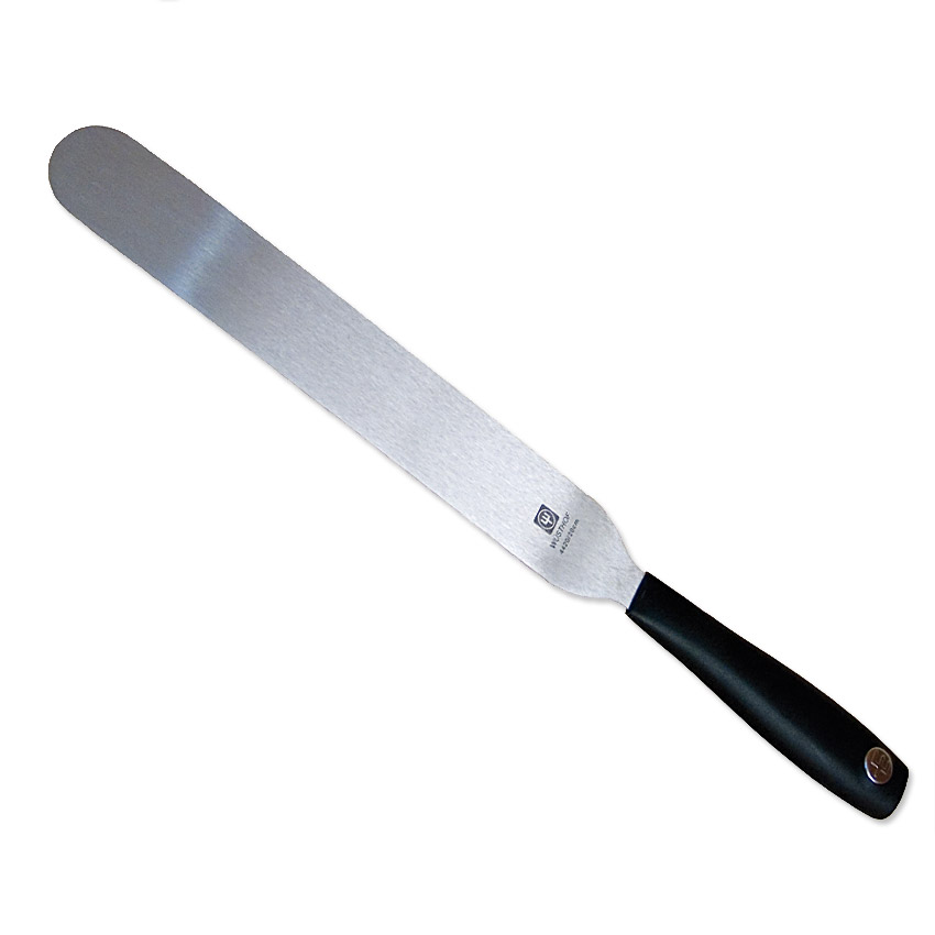
Palette Knife - This is used to spread paint onto the mesh for printing. Very handy and easy to use.
Scooper - This is tp put in the emulsion paint into the Mesh when prepping the screen for printing.

Squeegee - In screen-printing, a squeegee is used to spread ink evenly across the back of a stencil or silkscreen, making a clean image on the printed surface. Screen printing squeegees usually have much thicker and less flexible blades than the window cleaning variety.
When using the squeegee there are two types of that can be effective for the prints you make - flat and rounded tip. The flat tip squeegee gives a good controlled angle when printing while the rounded tip squeegee
will cause the ink to smear because it generally pushes more ink through the mesh. Some squeegee blades are actually made round or “ball nosed”. For most standard textile screen printing applications a rectangular cut edge squeegee is best.

Acetate Tape - The screens are either wood or metal and when printing it's better not to have any leaks.

Pressure Washer/Hose (I prefer pressure washer than jet wash by the way) - This is to help wash you screen after each time you want to use a different colour or you have finished printing for the day.

Light Box - When we need to re-draw somethign but want it to be EXATLY what you drew before then this is very useful as when you use it combine with orignal drawing and a new sheet of papper to use, then with this it is easy to trace what you have done before.

Different Printing Methods:
Woodblock Print
It is a technique for printing text, images or patterns used widely throughout East Asia and originating in China in antiquity as a method of printing on textiles and later paper. It is also one of the oldest printing technique which was originally used in carved and formed stamps and seals. However printmaking would not have been possible without the invention of the paper.
It can be used to create decorative purposes such as fabrics, tiles, leathers and wallpaper. It also to used as a printing text like books in countries where they speak Arabic - the Qur'an.
Nianhua is also form of coloured woodblock prints in China that creates images for decoration during the Chinese New Year and still is today.

The Great Wave off Kanagawa by Hokusai, a Woodblock artist
How to make your own Woodblock Print:


Use simple wood gouges to carve the wood and give yourself a lot of room around the pencil lines. You can always take away more wood but you can't add any back. For smaller details use pointed knives -this is especially important for the areas around faces but keep in mind that the wood left behind will be the darkest but if you need to create a light area like the sky, carve away all of the wood.
To make the print itself, add ink to the block with an ink roller. This will ensure that the ink is applied evenly. Then press the paper on the block, use slightly damp paper to help the paper cling to the frame of the wood. If the paper is too damp, the ink will run and spread on the paper.
You can use a smooth object to press and rub the paper onto the block. This will help the ink to fully transfer to the paper. You can then carefully remove the paper from the block. It is a good idea to wipe the ink from the block so that you prevent any gunk from building up around the highly detailed areas.
Letterpress Printing
Letterpress is a form of relief printing it involves locking movable type into the bed of a press, inking it, and rolling or pressing paper against it to form an impression

Letterpress is used a lot today - direct-mail postcards but mostly business cards - new companies, bridal party invites, save-the-date cards or wedding invitations.
How to make your own Letterpress Print:
The downside to do is that if you make it yourself, it would cost A LOT but if you have Adobe Photoshop - then you're in luck and here from another website is how you do it:
1. Open Adobe Photoshop, create a new document by going to the menu bar and selecting File -> New… The new document settings should appear. Set the different properties as you need. In this tutorial, we used the following settings listed below. Save your new PSD document with an appropriate name. Use the following settings.
- Width: 8.5 inches
- Height: 5.5 inches
- Resolution: 300 ppi
- Color Mode: CMYK

2. Once the document is open, copy and paste in the image or pattern that we want to have a letter press effect. Once it is inserted, take note that you can scale the image by pressing CTRL+T which should activate the transform box. Hold down the shift key whilst altering the transformation box to resize your image to scale.
3. Now, this will depend solely on your image. It is important that you adjust the colors so that they are a bit vibrant or vivid. Also, if there are any pure black colors in your image, you will want to lighten it up. The best way to do this is with a slight levels adjustment. Just go to Image -> Adjustments -> Levels. Then in the window that opens, slide the right or left marker until your blacks are a bit gray, and the colors a bit more vivid.

4. Next, we have a preparatory step. We will need two kinds of textures. One for the standard paper texture, and another for the pressed texture. We got a few free ones from deviant art. We will be using this one: http://winryie.deviantart.com/art/Watercolour-Paper-Texture-170544084 from winyrie as the base, and this one: http://enchantedgal-stock.deviantart.com/art/Drawing-Surface-Paper-Texture-49817351 , from enchantedgal-stock for the letter press. Download them or of course get your own as you need.
5. Now, we will do some tricks. First up, we go back to our main document with the pattern. We go to Select -> Color Range… and then we click on the “White” area of the document. Once done, press OK, and you will have selected only the white layers.

6. Then, press CTRL+C and CTRL+V to create a new layer based on our white selection. In the layers panel, rename this new layer as your white base.
7. Next, click on the original image layer again. This time, press CTRL+SHIFT+I. This will invert our selection to the colored parts. Press CTRL+C and CTRL+V again to duplicate this colored layer. In the layers panel name this your Colored Layer.

8. Now we will work on the White base texture. Remove the visibility of the other layers first by clicking on the eye icon to the left of them in the layers panel. Then, copy paste in our water color paper texture that we downloaded earlier. Make sure that this layer is on top of the base layer. Then right click on it and select the option to “create clipping mask”.

9. You should then see the texture get applied only to the area of our white base. Once you are satisfied, turn on the visibility of our colored layer.

10. For the colored layer, we first double click on it to access its layer style options. In the layer styles window that opens, select the “Inner Shadow” effect. Adjust the following settings listed below as needed to make the shadow believable. We have inserted some basic values that you can start out with though. Once you are done, press “OK”.
- Opacity: 60%
- Angle: 111 degrees
- Distance: 3px
- Size: 3px

11. Now, using the same trick as with the white base, we paste in the other texture image we downloaded earlier. We place its layer on top of the colored layer and then add the clipping mask. (right click and select clipping mask on the texture layer).

12. Now, we change the blend mode of the texture layer. Just look for the drop down menu on the top left side of the layers panel. With the texture layer for the colored layer selected, change the blend mode to “Multiply”. Then adjust the opacity setting (just across from the blend modes) to around 50%. This gives us the subtle texture on our colored layer.

13. Then, we will add a small emboss on the white base layer. Double click on it to bring its layer style options. Click on the “Bevel and Emboss” effect. Then apply the following settings below.
- Depth: 75%
- Size: 5px
- Soften: 1px
- Highlight Mode: Change to normal.
- Leave the rest as default.

Great! That should finish our letterpress effect from a pattern or image. If you want a more embossed look, just adjust the settings as you see fit.
References:
http://www.masterworksfineart.com/art/printmaking.php#4-woodcut
http://johnsteins.com/woodblock-printing.html
http://www.instructables.com/id/Creating-cutting-and-printing-your-own-woodblock/
http://johnsteins.com/woodblock-printing.html
http://www.instructables.com/id/Creating-cutting-and-printing-your-own-woodblock/
No comments:
Post a Comment